Big Data Public School Rankings
Who cares about "Good Schools"?
Do me a favor: Pull up a real estate listing online... Maybe it's the dream house you have saved on Zillow, or a starter apartment near your job. Maybe you were not previously aware that every single real estate listing displays public school rankings. Go ahead, find the school rating on that property listing. It is there, and if you are a parent, it's often the first thing you scroll down for.
The ubiquitous availability of information about public schools is a new phenomenon. Before "Big Data," school quality was a word-of-mouth affair. The Fair Housing Act of 1968 made it illegal for real estate brokers to engage in "racial steering," which had been the standard practice before the law passed. Fast forward to 2022, and many real estate brokers will tell you that they are no longer allowed to discuss school quality. I pressed a NYC broker about schools, and he told me he would be fired for saying anything. According to him, legal precedent had accumulated, suggesting "good schools" is a racial euphemism, which was used for racial steering. For many parents, Big Data is all they have to go on now.
Good Schools. By way of topics, it is pretty "cringe," (as the kids would say). Schools, money, retirement, etc. these topics are all mortifying to think about, much less talk about. But school quality matters, regardless of whether you are a parent. In our very-online, very data-driven age, school quality drives property values, tax bases, community resources, and probably the price you paid to live wherever it is that you live. It is not a coincidence that the most desirable locales in the nation also have highly rated schools. It is de rigeur for a "nice place to live."
US online real estate listings have one dominant player in the field of school data, which publishes rankings for all public schools in the country: GreatSchools.org. Other players, such as USNews, are decades behind, but are coming up fast. GreatSchools.org ratings are absolutely ubiquitous. Open any real estate listing online, whether it's in an aggregator like Zillow, or an agency site, and you will find GreatSchools' 1-10 ratings in the "schools" section. Go ahead and check it out yourself. It's there.
The important thing to remember when discussing school quality is that the topic may be academic to some, but to others, it represents their most tender hopes and dreams for the vulnerable little beings who mean the whole world to them.
In my first earnest foray into applied Data Science, I looked into the "Great Schools Rating," how it works, and what it tells us about our public schools.
How to measure school quality?
Education is not a typical as a product or service. A typical product or service is enjoyed or consumed. "School Quality" on the other hand is about learning. And learning is not passive: It is about teachers teaching, but it is also about learners learning. Schools don't "deliver" knowledge, they teach it. To measure the quality of a typical product, you devise a set of "indicators" i.e. objective markers of desirability, and test for those indicators. Not so with school quality! Aptitude among learners is as unevenly distributed and of unimaginable variety.
To analyze the issue of school quality properly, one needs first to parse its principal components. Which features pertain to the quality of education being offered at a school, and which pertain to the students' ability to absorb what is being offered? In other words, which indicators are features of learners, and which are features of the quality of educational opportunity? Schools that teach a high quality student body may produce good performance for reasons not altogether due to quality instruction, and vice versa for poor performance.
Hypothesis: What makes great schools "great"?
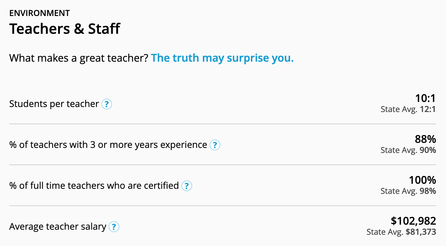
My Hypothesis: Factors that most indicate school quality will be those that represent quality of education on offer. Factors such as teacher experience, student-teacher ratios, student-counselor ratios, and teacher salaries, will be the most predictive factors for above-average school ratings.
What I found through analyzing the data was not at all what I expected.
Background: GreatSchools Summary Rating
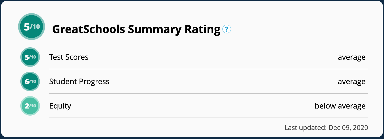
The "Summary Rating" at its most basic level represents standardized test scores. For elementary schools, these scores are pretty simple: English and Math. For middle and high schools, there are many other test scores that contribute to the data. There are in fact three components that make up the "Summary Rating" but they are three ways of digesting the underlying standardized test score data:
1. Does the school exceed the "State Average" for standardized test scores?
2. Is there "student progress," i.e. improving test scores year over year?
3. How well do poor students perform, versus their more fortunate peers?
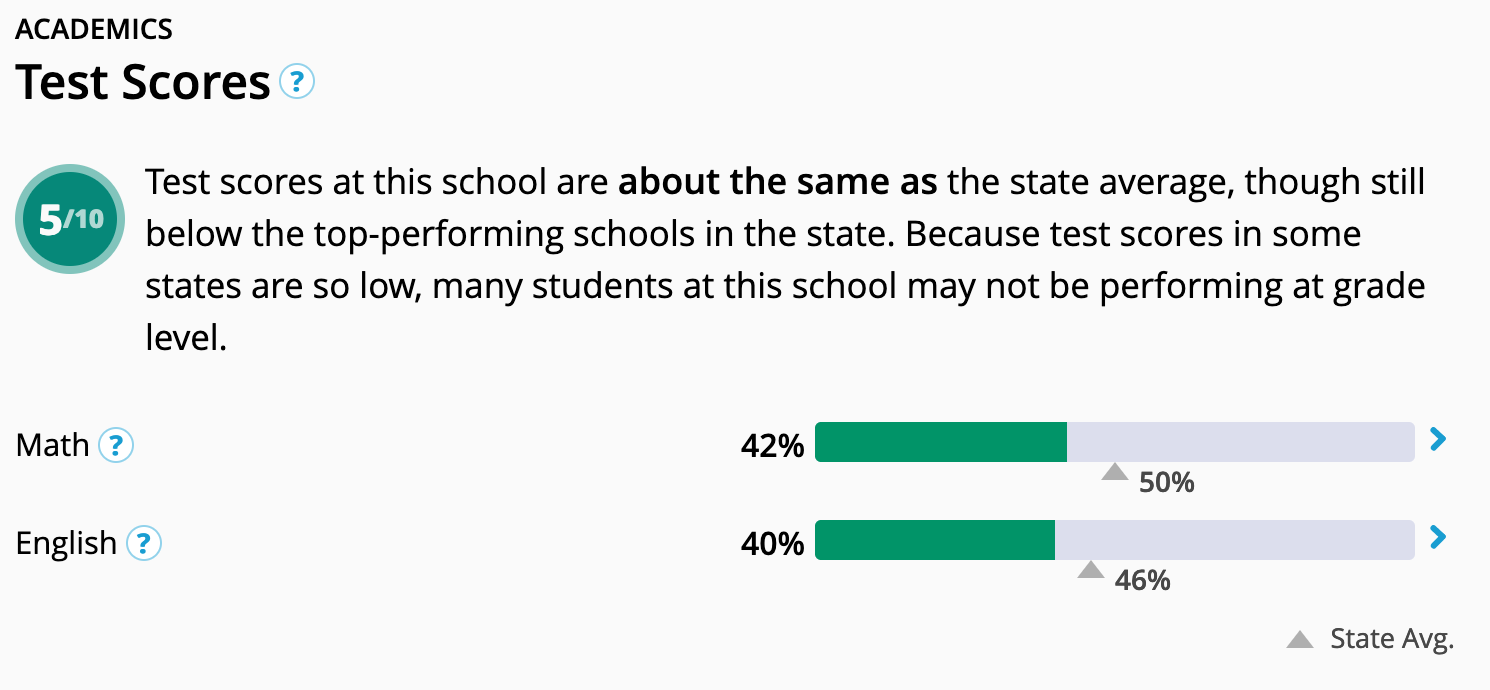
Let's look at an example in the image below. The New York State average for proficiency in reading and math is about 50%. In other words, about 50% of elementary age students in New York State fail their reading and math tests. For a school to be "above average" therefore, it would need to have more than 50% of their students pass their tests. The figure below shows a school whose test scores are below the state average.
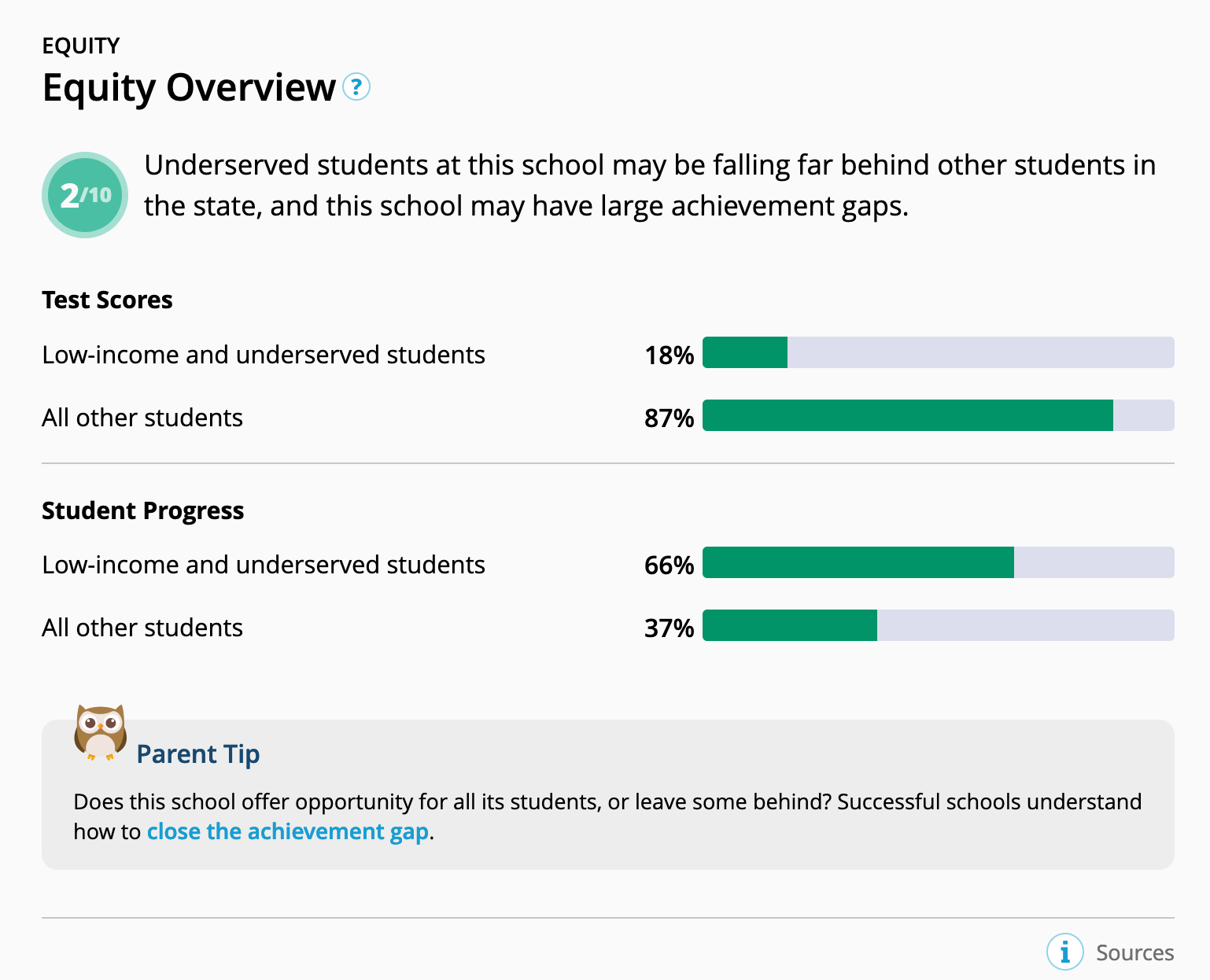
Below is an example of the "equity" and "student progress" components of the summary rating. In schools with a lot of low-income and underserved students, good teachers should have some measurable effect on closing the equity gap, according to GreatSchools rating methodology. In the example below, you can see that low income students perform terribly on tests compared to their peers, which is bad. But, they also improve far more over the years, which is good. The latter metric is obviously flawed, as it is harder to beat your own scores every year when you're already doing really well.
Finally, the last figure below shows the type of indicators which are most likely to capture the quality of instruction on offer. These indicators do not eliminate socioeconomic bias, since they largely depend upon the tax base of the public district, and a high tax base usually means privileged students. But at least these indicators allow us to compare schools without relying entirely on test scores.
Findings
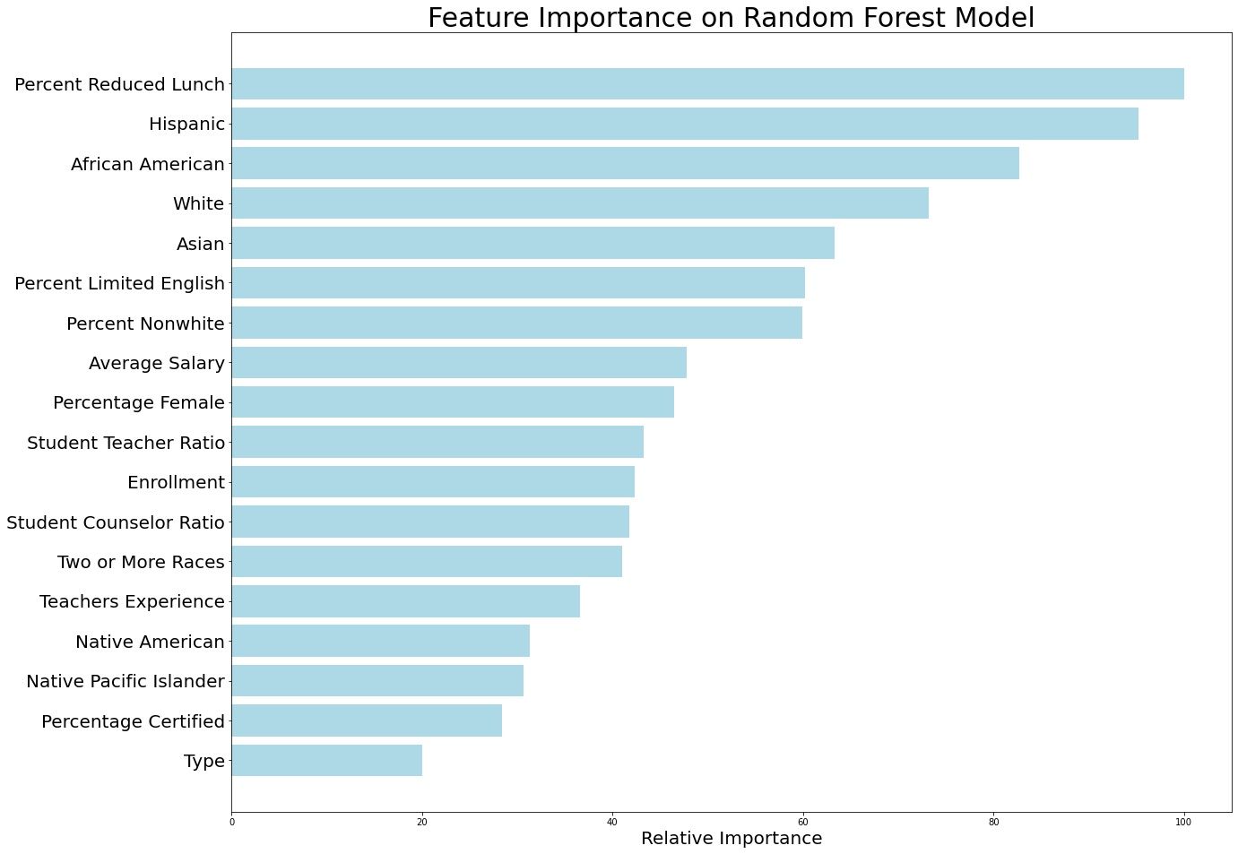
All models used in this study showed that features with the most predictive power for school quality were categories of the race of the student body. Let me repeat that: The biggest predictor of a "good" school (in the population in question), was just the racial makeup of the student body. All other factors being equal, if a school has high percentages of black and latino students, you can conclude that it most likely has a low rating. In the year of our lord 2022, that is bad news. However, the news is not all bad. If only the race of the students is considered, the predictive power of the data drops below usability, which means that race is a surface feature, rather than an explanatory one. Something else is going on behind the scenes.
While I tested a number of different models, the model with the highest predictive power was the "Random Forest" model (R2 = 0.74). This model, unlike the other models, showed "Percent Reduced Lunch" as the most predictive variable of school ratings, rather than "Hispanic" or "African American." In my view, the Random Forest model was able to suss out the operative principle behind the race data. As noted previously, using only "Race" produced a weak model with relatively poor predictive power. Instead of an R2 score in the 0.7's, the R2 dropped to 0.29, (which means that the model explains only a minor fraction of the overall variation in the data).
An importance clue came early on in my data analysis. One of the first things data scientists like to do is to create a correlation "Heat Map," and I made a good one. A heat map cross references each column of your data with every other column of your data (a correlation of 1 or 100% can be found on the diagonal, as it shows each feature cross referenced with itself). Dark greens are strong positive correlations, whereas dark reds are strong negative correlations. Normal data with messy, dirty real world sources typically does not yield powerful correlations. In my data, I created a category called "Percent Non-White," which shows how white a student body is. Percent Non-White turned out to have a 0.93 or 93% correlation with "Percent Reduced Lunch," which is a proxy for low-income status.
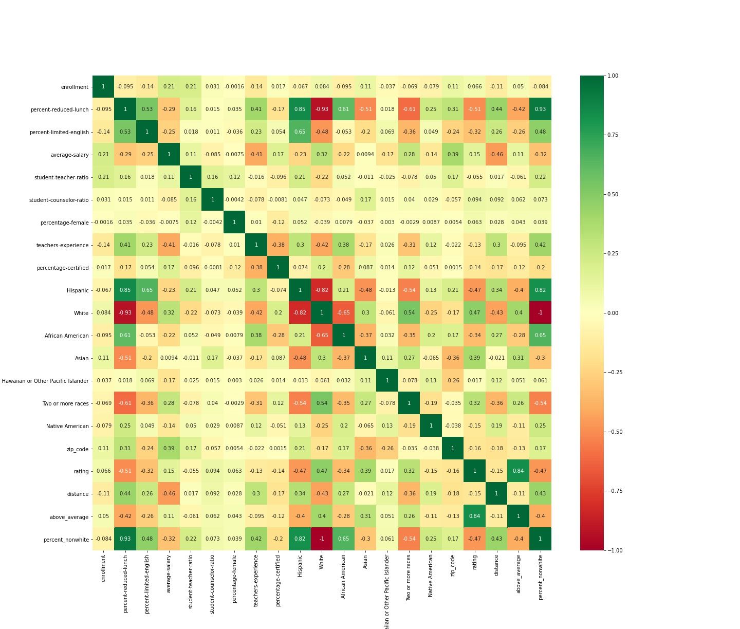
In other words, in the population of schools that I looked at, which were in the NYC Metro area, there is a 93% correlation between students being poor, and students being non-white. Let me say that again, because that is a fairly remarkable statistic. If you pick any white kid at random from the population that I studied, that child has only a 7% chance of being poor. If you pick any non-white kid from the population, that kid has a 93% chance of being poor. For a liberal area that prides itself in "equal opportunity," it is startling how racialized the poverty is. It is almost as if poor whites have left the area entirely.
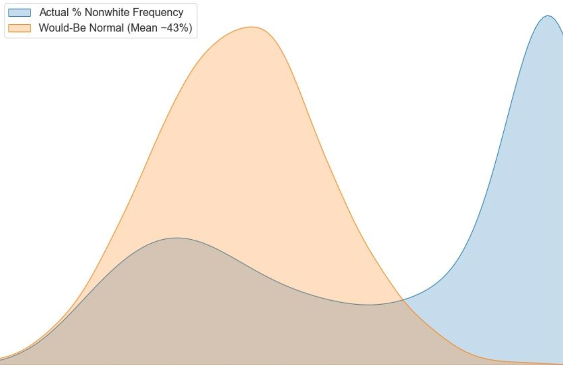
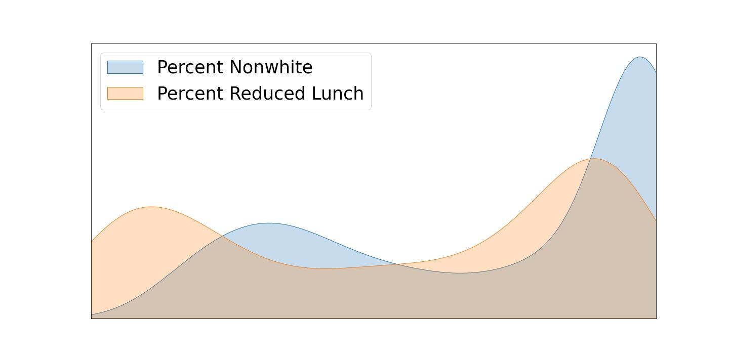
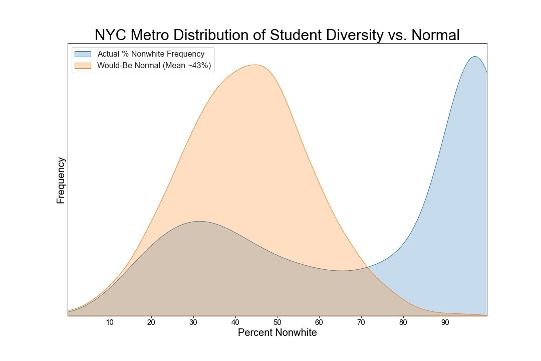
I superimposed the density distributions of "diversity" and "poverty," as captured by the proxy features "Percent Nonwhite" and "Percent Reduced Lunch." Below is the image that was generated. Normally distributed data looks like a bell curve, with median quantities being the most frequently observed. However, this data is not at all normally distributed. Only a tiny percentage of schools are mostly white, and a huge number of schools are mostly nonwhite. In the middle, where the demographics would be ~50/50, you find the least number of schools observed, likely because NYC metro area schools are highly segregated.
Again, please understand that the below data viz shows two density functions superimposed. The middle value is in the middle, and the bottom and top deciles are left-to-right. Really, these distributions represent the fundamental inverse of normality.
Given how the above figure shows a distribution that is actually the opposite of normal, I decided to superimpose a randomly generated normal distribution, with a mean of ~43%. According to an online source, Westchester, NY is approximately 57% white, which means that a school that represents the demographic makeup of the County would have about 57% white kids (45% non-white). But it almost doesn't matter what the exact median is, because the normal curve is simply there as a visual guide to remind us that it's a density function we are looking at.
In summary, the racial makeup of the student body is the most powerful predictor of public school quality in the NYC metro area. However, racial makeup alone was a poor predictor of a high school rating. Most likely because race is correlated powerfully with income. It is possible that the race performance gap would shrink if the income stats changed.
In other words: Race alone does a poor job at telling the story of school quality
RFM
Conducted quartiles analysis showing which schools bucked the trend, with high diversity and high scores.
Methodology Details
Two datasets pulled from Greatschools.org API, joined
Wherever piecemeal missing values occurred, they were replaced with a weighted version (weighted with their most strongly correlated value)
In the absence of any strong correlations, missing values were replaced with means
Simple linear regression on rating was conducted to preliminarily understand feature selection
Ratings were bucketed into above average and below average target
Logistic, Decision Trees, and Random Forest classifier models trained and tested
Quantiles analysis conducted
Data was restricted to New York City metro area with a 30 mile radius from my home in Mount Kisco, NY as analysis of vastly differing regions would come with foreseeable and unforeseeable issues, which may not be resolvable in the allotted time
MinMax scaler used because key features not normally distributed
SVR vs. Linear Regression indicative of non-linear interactions within the data
Recursive Feature Elimination showed that the optimal number of predictors was twelve, after which point adding did not improve score
Quantiles analysis showed that only 1.5% of schools in our dataset were in the top quantile for racial diversity, economic diversity, and rating.
What's Next?
Raised the question of "How racialized is poverty?" Which I intend to investigate next. In other words, where are the highest positive and negative correlations between "non-white" and "free lunch" on a map of the country.